Cars, Friends, and CabotFest
Started out this morning meeting up with some friends just a few minutes from the
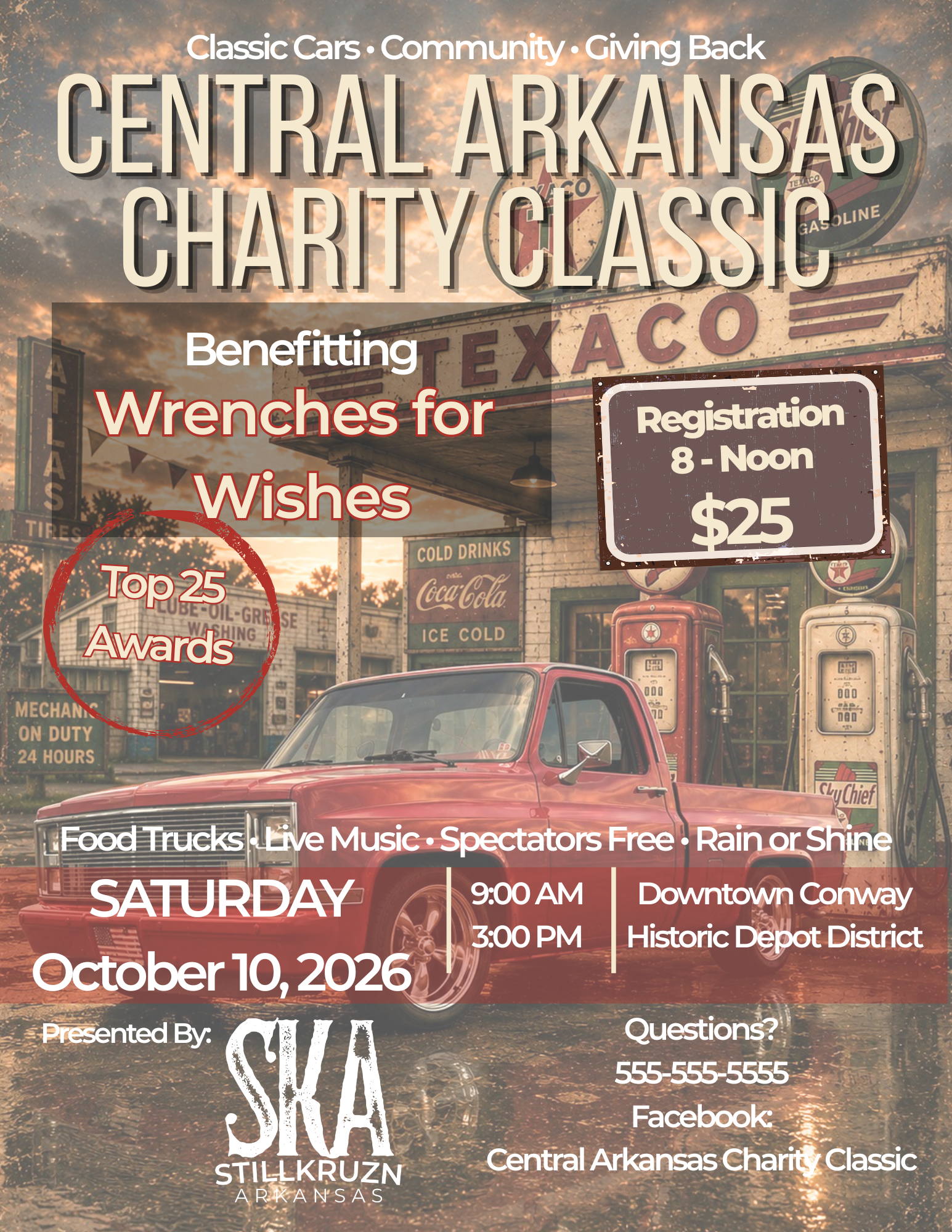
There have been a lot of AI-generated car show flyers showing up on social media lately. If you've read the comments, you've probably seen plenty of opinions about them—and many people feel they shouldn't be used at all.
I understand where they're coming from. Some AI-generated flyers simply aren't very good. They can be overly busy, cluttered, difficult to read, contain misspelled words, or even leave out important information. In many cases, they look like they were created with little or no human involvement.
At the same time, I also understand why people are using AI. When it's used correctly, it can be an incredible creative tool. I use AI almost every day, whether I'm creating content for StillKruzn Arkansas or working on projects at my day job.
So instead of debating the topic in another social media comment thread, I decided to try a little experiment.
I wanted to see if people could tell the difference between a flyer that was completely AI-generated and one where AI was simply used as a tool in the design process.
For this experiment, I created a completely fictional car show flyer for a fake event.
I started by using ChatGPT—my AI tool of choice—to help create the background artwork using a series of prompts. Once I had a background I liked, I finished the flyer using the same design tools I use on a regular basis.
For this project, I chose Canva because it's a tool that many people use today. I also have access to Adobe Photoshop, InDesign, and several other professional design applications, but I wanted this experiment to reflect a workflow that is accessible to almost anyone.
Once the flyer was finished, I posted it on Facebook and asked one simple question:
Was it AI Generated or Human Generated?
The responses were exactly what I had hoped for. Some people were convinced it was AI-generated. Others believed it was created by a person. And several guessed what turned out to be the correct answer—it was a combination of both.
To get started, I uploaded two images into ChatGPT: a photo of my truck and the StillKruzn Arkansas logo. Those would become the foundation for the background artwork.
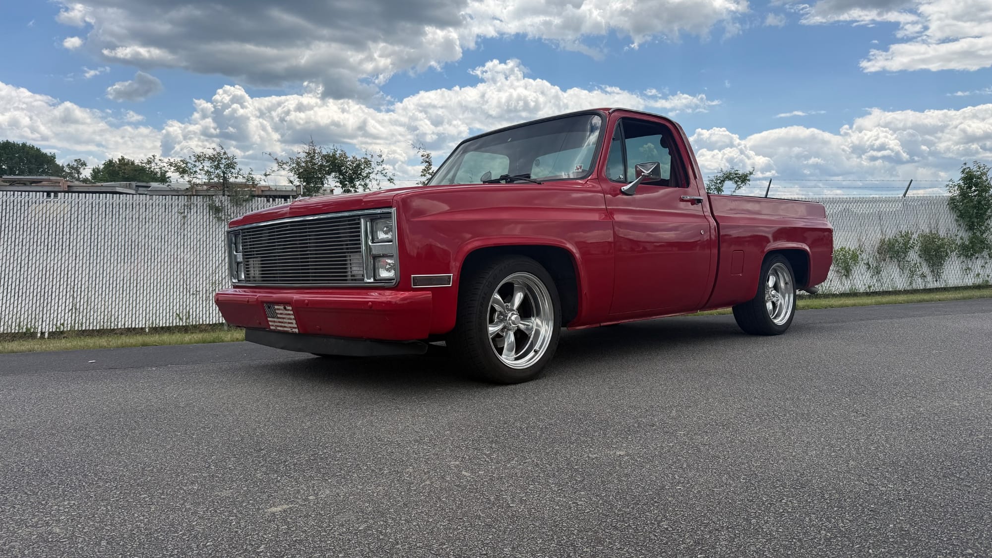
Next, I gave ChatGPT a description of what I wanted to create. My prompt was simple:
Here are a couple pics that I want to use as the background image of the "fake" flyer. You will need to remove the background on the image of my truck. I would also like a vintage gas station in the background image that we are creating. The size needs to be 8.5x11 portrait. Other than this instructions, I am giving you some liberties on this project only for now. I really want to get my point across that there is nothing wrong with using AI on creating flyers as long as it's done correctly.
Like most AI-generated artwork, the first attempt wasn't perfect. In fact, it took several iterations before I found a background that matched the vision I had in mind. That's one of the things people often don't see—you don't always get exactly what you want on the first try. Sometimes it takes refining your prompts, making adjustments, and trying again until you get a result that works.
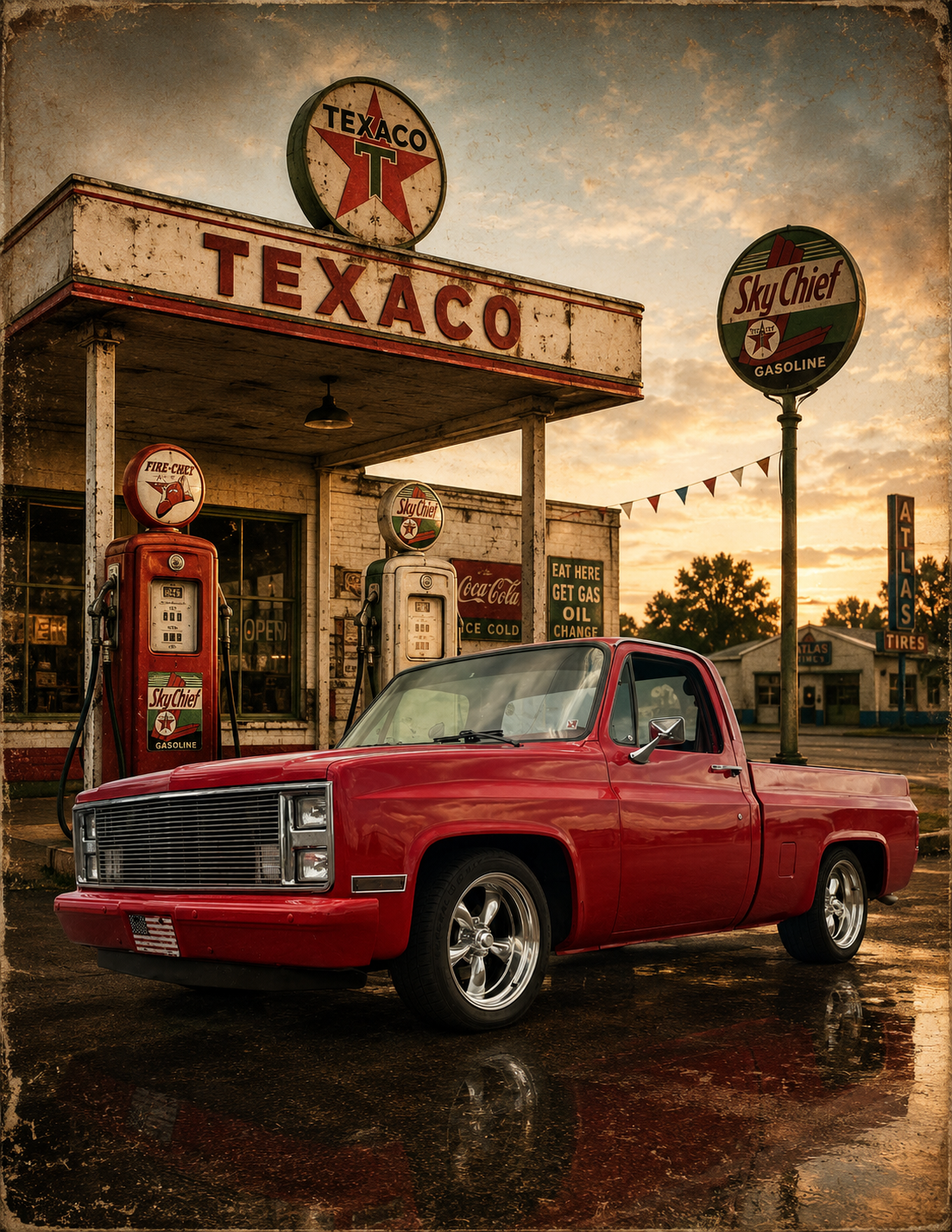
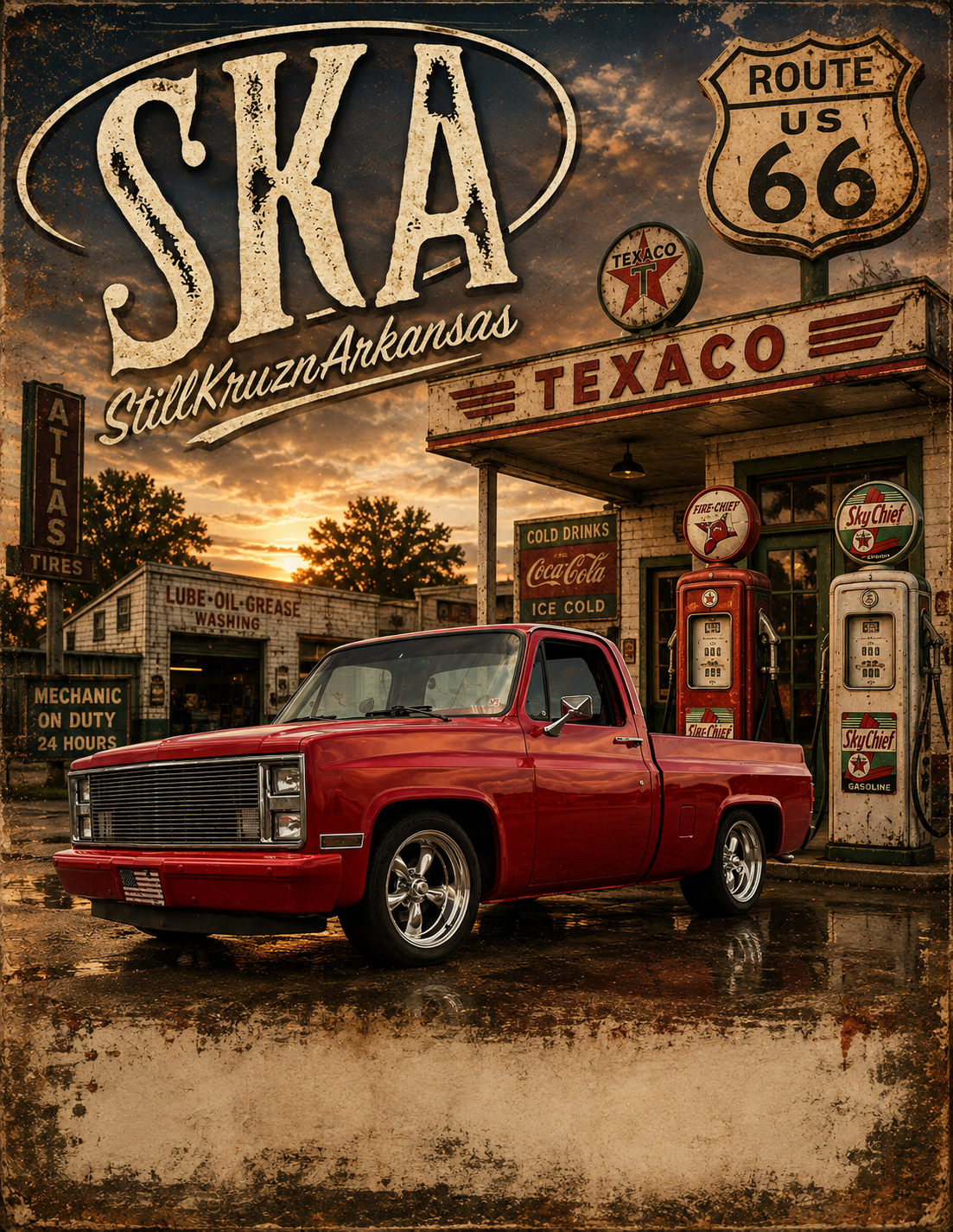
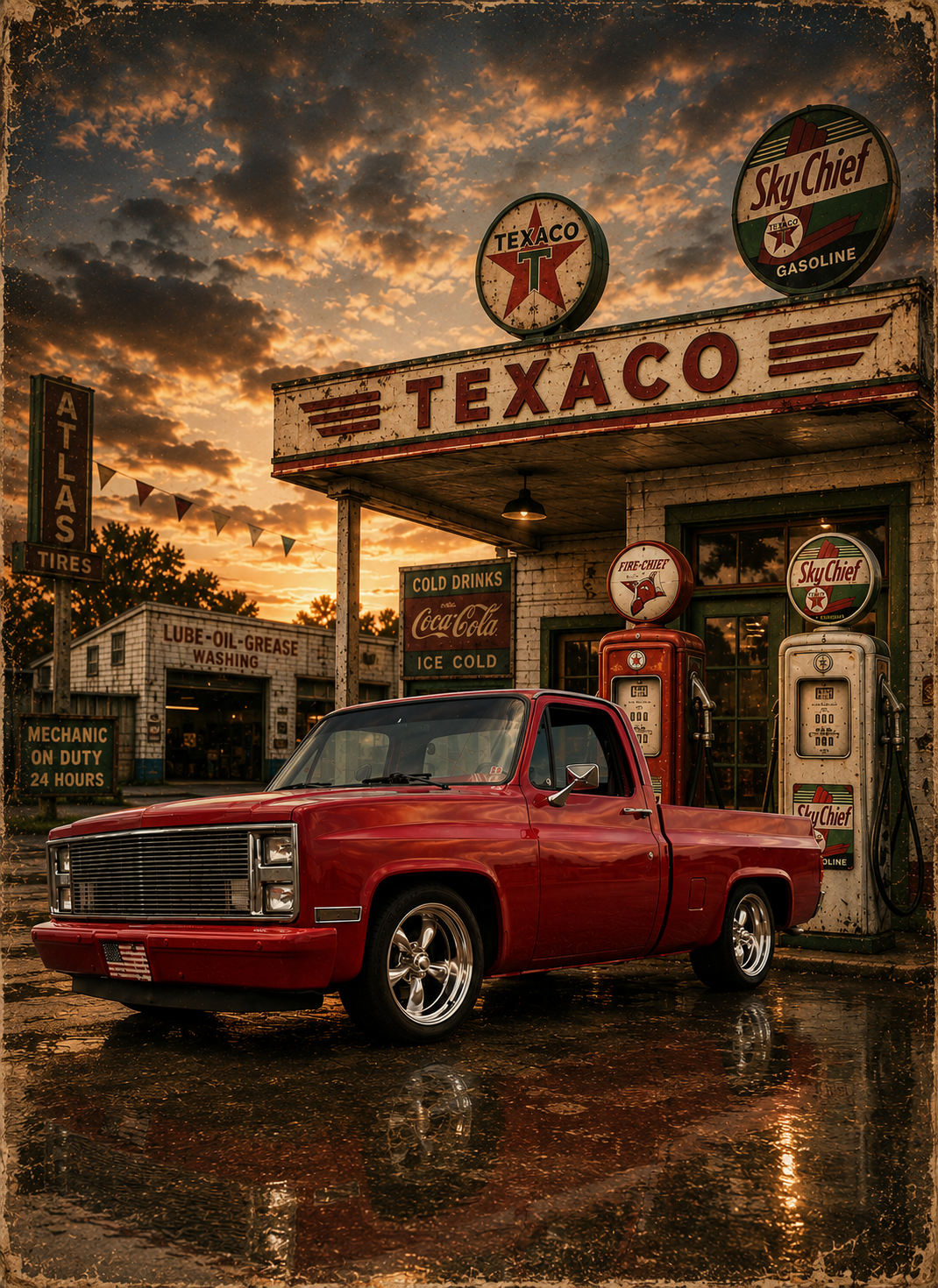
After looking through the different versions, I chose the third image as the one that best fit the style I was after.
With the background complete, I moved over to Canva and created a new 8.5" × 11" portrait project. I imported the AI-generated artwork and set it as the background for the flyer.
At that point, the AI's job was essentially finished.
The rest of the project was about design.
In the end, AI handled a few specific tasks for me.
It removed the background from the photo of my truck, created the vintage gas station scene, and generated several different background concepts based on the prompts I provided.
Although I also uploaded the StillKruzn Arkansas logo, I chose not to use the AI-generated version. Instead, I added my original logo later while assembling the flyer in Canva. That ensured the logo remained crisp, accurate, and true to my branding.
Once I had a background I was happy with, AI's role in the project was complete. Everything that followed was done using traditional design tools.
Once I had the background image, my part of the project really began.
For this experiment, I chose to build the flyer in Canva. I have access to Adobe Photoshop, InDesign, and several other professional design tools, but I wanted to use something that almost anyone could access and use themselves.
Before I ever started placing text on the page, I already had a vision in my mind of what I wanted the finished flyer to look like. I knew the overall style I was after, the color palette I wanted to use, and how I wanted people to read the information.
Good design isn't just about making something look nice. It's about guiding the viewer's eye through the page. I wanted the title to grab attention first, followed by the event details, registration information, features, and finally the contact information. That information hierarchy is just as important as the artwork itself.
I also wanted the flyer to feel balanced. One thing I've never liked is a flyer that feels cluttered or looks like it's leaning to one side because too much information has been crammed into one area. I prefer to use as much of the page as possible while still giving each element room to breathe.
For the typography, I chose two fonts that complement each other well: Montserrat and Bebas Neue. They provided the bold, clean look I was after while remaining easy to read. I also selected a simple color palette of cream, brown, red, and gray that worked naturally with the vintage gas station background.
One detail many people never think about is making the text feel like it's sitting above the background instead of getting lost in it. By using subtle outlines, shadows, and layering, the text appears to lift off the page just enough to improve readability and establish a clear visual hierarchy. Those effects aren't there just to look good—they help separate the text from the background and naturally draw your eye to the information that matters most.
Like most design projects, this wasn't finished in a single attempt. I went through several revisions, adjusting the layout, spacing, colors, and placement of different elements until everything felt right.
Throughout the process, I also used ChatGPT as a second set of eyes. After each revision, I asked for feedback and suggestions. Sometimes I agreed with those suggestions and made changes. Other times I trusted my own instincts and left things exactly as they were.
At the end of the day, that's still part of the design process. AI can offer ideas and feedback, but the designer is the one making the final decisions.
Over the past couple of years, I've learned where AI fits into my workflow. More importantly, I've learned what it's good at—and what it isn't.
I've never been convinced that AI can replace designers. What it has convinced me of is that it can become another valuable tool in a designer's toolbox.
For me, AI is no different than Photoshop, Illustrator, Canva, or any other design software. It's another creative tool that, when used correctly, can help bring an idea to life. But just like those tools, it doesn't replace creativity, experience, or good design principles.
This experiment reinforced something I already believed. AI created the artwork, but it didn't design the flyer. The layout, typography, color choices, spacing, visual hierarchy, and dozens of small design decisions were still made by a person.
Like any tool, the results depend on the person using it.
A hammer doesn't build a house. A camera doesn't take a great photograph. And AI doesn't automatically create a great flyer.
They're all just tools.
It's what you do with them that makes the difference.
I'm not a graphic designer by trade, but I am someone who genuinely enjoys creating things. Over the years, I've developed a style that fits me and the StillKruzn Arkansas brand.
When I create a flyer, I naturally gravitate toward clean layouts, balanced spacing, and typography that's easy to read. I want the information to be the focus, with the background supporting the design instead of competing with it. Most of the time, I actually prefer little or no background at all, although my style continues to evolve as I learn and try new ideas.
Has AI become part of my workflow?
Absolutely.
Whether I'm creating content for StillKruzn Arkansas or working on projects at my day job, AI has become another tool I use on a regular basis.
Will it ever replace the final decisions about the look, feel, and overall direction of what I'm creating?
Absolutely not.
Those decisions still come from experience, creativity, and the vision I have for the finished piece.
For me, AI isn't the designer.
It's just another tool on the workbench... or another tool in the toolbox.